Case study
Full House
Evolving a Multi-brand Design System
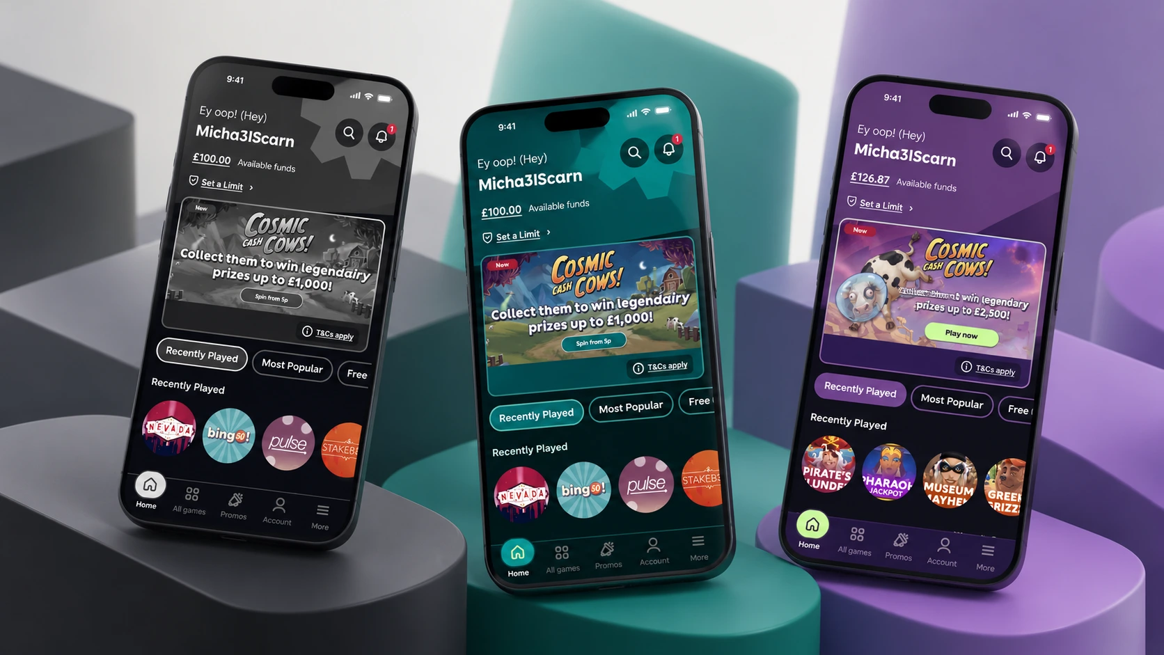
Summary
Evolving the system
Building on the foundations already in place, I helped evolve Full House into a comprehensive, multi-brand Design System through a systematic review of its components, a stronger token architecture and a more consistent approach to reusable patterns.
Full House supports tombola and its wider product ecosystem. The question was what the system needed next to serve the products it was intended for. The aim wasn’t simply to create more components, but to understand what the system actually needed, strengthen its foundations and establish a more sustainable way of evolving it, so that what we designed could be built and maintained confidently in code.
My role
As Lead Product Designer, I helped define the direction, priorities and roadmap for Full House and coordinated the design work needed to move the system forward. I was directly involved in component design, token architecture, accessibility, documentation and reviewing implementation quality, and I supported other designers through mentoring, feedback and shared standards. I worked closely with Product and Engineering to balance design quality with implementation and maintenance requirements. The evolution of Full House was a team effort: my contribution combined hands-on work with responsibility for its direction and design quality.
Key design decisions
We started with a component-by-component review of the whole system, looking beyond the designs in Figma. For each component we asked whether it met a genuine product need and assessed its UI, properties, states, variables, documentation and readiness for development. Some components were worth retaining, others needed significant improvements, and some were no longer justified by the needs of our products.
Consistency at scale: Buttons
Buttons are one representative example of that review. They were widely used, with considerable inconsistency in their variants, sizes, states and properties, and changes affected many interfaces. We established a shared component structure, simplified variants, removed unnecessary duplication and improved interaction states, accessibility and the connection between properties and design tokens, balancing standardisation with brand flexibility. The updated Button component was implemented in production.
Shared foundations, distinct brands: token architecture
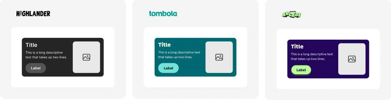
As we reviewed the components, it became clear that some inconsistencies originated in the token architecture itself. We restructured the hierarchy, consolidated variables and introduced clearer naming and contribution rules, so that brands could share a common structure without losing their individuality. I contributed directly to these architectural decisions, working with Engineering to align them with implementation.
Outcomes
Full House is now used in live product experiences, supporting reusable components across different brands and products. The work has contributed to greater visual consistency, easier maintenance, improved accessibility and documentation, reusable components backed by component documentation, clearer contribution, review and QA processes, and greater autonomy and collaboration between the teams working with the system.
The system continues to evolve.
Design System review
Component by component
What each component was assessed on
Possible outcomes
Prioritised first: Buttons and Inputs.
Token architecture
Shared foundations, distinct brands
Shared foundations
Common structure, naming and contribution rules
Highlander
tombola
tombola arcade
Four considerations
- Shared structure
- Existing dependencies
- Clear naming
- Sustainable contribution
Full case study
Full House is the Design System supporting tombola and its wider product ecosystem. Working with the team, I helped evolve it into a more comprehensive, multi-brand system, providing shared foundations while accommodating the needs of different brands and experiences.
When I joined, the Design System already existed and gave us foundations to build on. There was an opportunity to evaluate it systematically against the needs of the products it was intended to support: bringing components up to date, applying variables more consistently and strengthening documentation so that it could better support Engineering implementation.
The challenge wasn’t simply to create more components. It was to understand what the system actually needed, strengthen its foundations and establish a more sustainable way of evolving it.
Understanding the Challenge
We started with a comprehensive, component-by-component review of the entire Design System, looking beyond the designs in Figma.
For each component, we questioned whether it addressed a genuine product need and assessed its UI, properties, interaction states, variables, documentation and readiness for development.
This wasn’t about keeping everything that already existed. Some components were worth retaining, others needed significant improvements, and some were no longer justified by the needs of our products.
At that point, the Design System components we were reviewing had not yet been implemented in Engineering. Our work needed to close the gap between having a component in Figma and having something sufficiently defined to build and maintain in code.
We prioritised foundational components such as Buttons and Inputs, establishing a roadmap to guide the wider evolution of Full House.
The review involved many different decisions across the system. The following examples illustrate two of the more challenging areas we worked through.
Design System review
Component by component
What each component was assessed on
Possible outcomes
Prioritised first: Buttons and Inputs.
Key Design Decision 01: Consistency at Scale
A Closer Look at Buttons
Of all the components we reviewed, Buttons was one of the most challenging.
Buttons were already widely used across the product, but there was considerable inconsistency in their variants, sizes, states, properties and visual treatments. Some tokens were missing or incorrectly applied, while documentation and accessibility also needed attention.
Unlike a component with limited usage, changes to Buttons had implications across multiple interfaces. Every decision needed to consider not only the component itself, but also how it would affect existing product experiences.
Rather than preserving inconsistent patterns, we established a shared component structure, simplified variants and removed unnecessary duplication. We also improved interaction states, accessibility and the connection between component properties and design tokens.
Supporting multiple brands meant balancing standardisation with flexibility. We wanted a consistent underlying component without forcing every brand to look the same.
Some decisions required changes to existing interfaces. Working with Engineering, we weighed those changes against implementation complexity and long-term maintenance.
The updated Button component was implemented in production, providing a reusable, more consistent foundation across brands, with clearer documentation and improved accessibility.
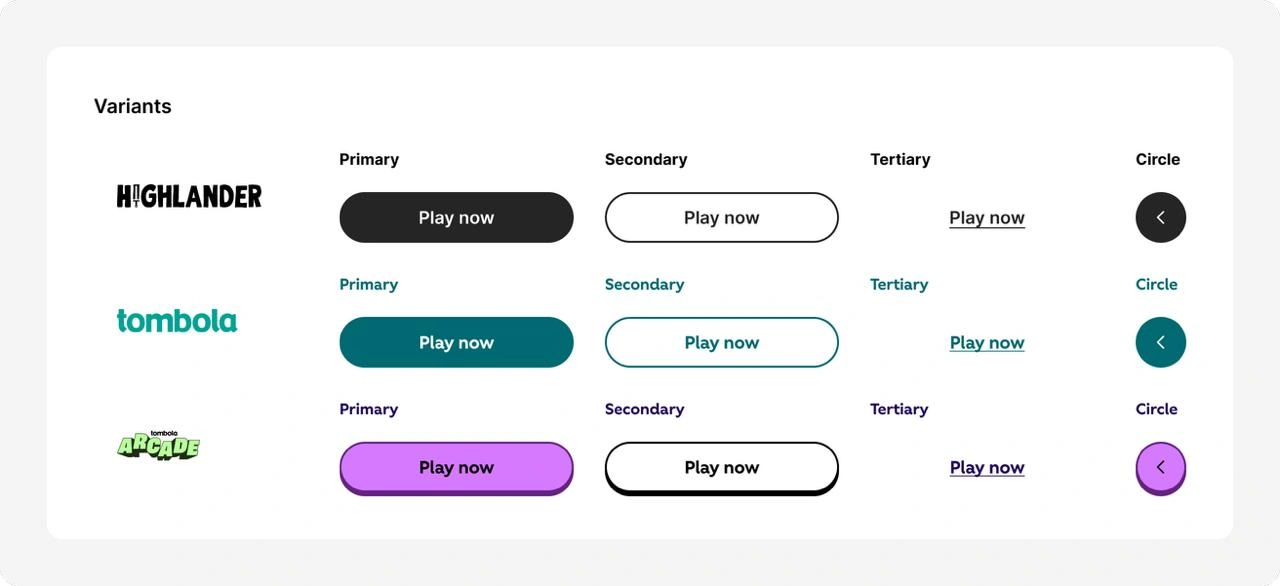
Buttons is just one example of the broader work involved in reviewing, challenging and evolving the components that made up Full House.
Key Design Decision 02: Shared Foundations, Distinct Brands
Rethinking the Token Architecture
As we reviewed Full House, it became clear that some inconsistencies originated in the token architecture itself.
Variables were missing, duplicated or inconsistently applied. Naming conventions also needed attention, particularly as the system supported different visual identities.
We restructured the hierarchy, consolidated variables and introduced clearer naming and contribution rules.
Four considerations shaped our decisions:
- Shared structure: Establish common foundations without losing the individuality of each brand.
- Existing dependencies: Update components already connected to variables without introducing further inconsistencies.
- Clear naming: Make variables understandable and predictable for designers and developers.
- Sustainable contribution: Establish when to reuse an existing token and when a new one was justified.
I contributed directly to these architectural decisions and the work of restructuring and connecting variables across components.
We also worked with Engineering to align the design architecture with implementation requirements.
This gave Full House a clearer foundation for supporting different brands while reducing unnecessary duplication and making future changes easier to manage.
Token architecture
Shared foundations, distinct brands
Shared foundations
Common structure, naming and contribution rules
Highlander
tombola
tombola arcade
Four considerations
- Shared structure
- Existing dependencies
- Clear naming
- Sustainable contribution
From Design to Production
Improving Full House required close collaboration between Design and Engineering.
We worked through component specifications together, aligned design tokens with their implementation and iterated when technical constraints or implementation questions emerged.
Storybook became a reference for developed components, while Chromatic supported visual QA. We also reviewed interaction states and accessibility before design sign-off and release.
This process helped establish clearer expectations for component quality and a more consistent approach to moving work from Figma into production.
Not every component moved through the process at the same time. Some were already live, while others continued through development, validation or planning.
From design to production
Figma, Storybook, production
- FigmaComponent specifications
- TokensAligned with implementation
- StorybookReference for developed components
- ChromaticVisual QA
- ReviewInteraction states and accessibility
- ReleaseDesign sign-off, then production
Not every component moves at the same time
Impact & Outcomes
Full House is now used in live product experiences, supporting reusable components across different brands and products.
The work has contributed to several meaningful improvements:
- Greater visual consistency through shared components and design standards.
- Easier maintenance through a more coherent token and variable architecture.
- Improved accessibility, interaction states and component documentation.
- Reusable components developed in Engineering and documented in Storybook.
- Clearer contribution, review and QA processes.
- Greater autonomy and collaboration between the teams working with the system.
Full House continues to evolve through an ongoing roadmap, balancing existing product needs with improvements to the system’s foundations.
Leadership & Learnings
My Role in Shaping the System
As Lead Product Designer, my responsibility extended beyond designing and maintaining components.
I helped define the direction and priorities for Full House, established the roadmap and coordinated the design work needed to move the system forward.
I was also directly involved in component design, token architecture, accessibility, documentation and reviewing implementation quality.
An important part of my role was supporting other designers. I distributed and reviewed work, provided mentoring and feedback, and helped establish shared standards so that designers could make decisions with greater autonomy.
Alongside this, I worked closely with Product and Engineering to align priorities, resolve dependencies and make decisions that balanced design quality with implementation and maintenance requirements.
While the evolution of Full House was a collaborative effort, my contribution combined hands-on problem-solving with responsibility for its direction, design quality and the way the team worked together.
What I Learned
Start with real product needs. A Design System doesn’t become more valuable simply by having more components. Understanding what products and teams actually need should shape what gets built and prioritised.
Consistency requires difficult decisions. Improving a shared system sometimes means changing established patterns. The challenge is knowing when consistency creates more value than preserving existing differences.
A sustainable system depends on shared ownership. Good components need more than good design. Clear documentation, collaboration with Engineering, contribution processes and empowered designers are essential to keeping a system useful as it grows.
Above all, working on Full House reinforced the importance of balancing immediate improvements with a longer-term direction, while creating the conditions for others to contribute to the system confidently.